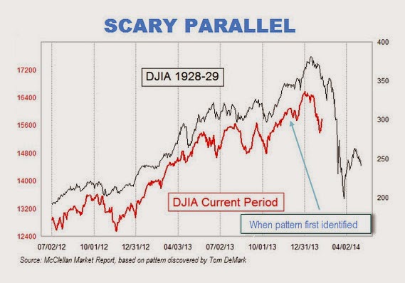
Back in 2014, a chart, purporting to show great similarities in the movements of the DJIA at that time with the period preceding the crash of 1929, was making the rounds on Wall Street. Here is the chart, reproduced here just in case the original disappears:
![[ Scary DJIA graph from 2014 ]](/2016/04/scary-djia-mcclellan-demark.jpg "Scary DJIA graph from 2014")
Time series of random walks can look similar over various arbitrarily picked segments, and, especially when looking at line graphs over limited windows, it is easy to “see” relationships that may not really be there.
In any case, I was reminded of this story today, so I decided to check how things have developed since 2014. One can look at the recent performance of the DJIA, and say everything is hunky-dory because predicted the precipitous fall has not happened:
![[ DJIA over the past five years ]](/2016/04/djia-google-20160331.png "DJIA over the past five years")
On the one hand, DJIA looks rather flat since 2014. On the other hand, there have been two significant dips. How do these compare to what happened in the period leading up to Black Tuesday?
I decided to widen the time periods to compare well defined ranges that seem less arbitrary. For the time period leading up to and covering the beginning of the Great Depression, I picked the time period from January 1, 1920 to December 31, 1932. Why? Because it begins when things were relatively stable, and covers the crash and its aftermath.
For the current period, I decided to go back to January 1, 2004 simply because that time period will have covered the same range by the end of this year.
If I recall correctly, St. Louis FRED used to have the entire DJIA series, but these days they only have the most recent 10 years. That meant I had to go trolling for the data elsewhere on the web.
I quickly landed at quandl.com who pointed me to a series from the statistical database of the Central Bank of Brazil. As a sanity check, I compared the most recent ten years of data, and found no difference, and so I decided it would be OK to use this series.
To put both series on a comparable scale, I normalized each observation using the index value on the first day of the corresponding period.
Now, there are two ways of lining up the two windows into this series. One is to line up trading days from the origin. This corresponds to the naive way of copying and pasting the two series side by side in a spreadsheet (or equivalent) and eyeballing them.
Here’s what you get if you do that:
![[ DJIA during great depression versus recent times, lined up on trading days ]](/2016/04/djia-crystal-ball-trading-days.png "DJIA during great depression versus recent times, lined up on trading days")
I suspect this was done with the original graph as well—except that starting dates of each period seem to be arbitrarily selected.
There is a problem with this method: When we line up the data on trading days since origin, the observations end corresponding to more and more different dates. For example, the 1000th trading day after January 1, 1920 is May 4, 1923. On the other hand, the 1000th trading day after January 1, 2004 is December 20, 2007. Clearly, early May and just before Christmas have different seasonal factors affecting the economy and the stock market.
Looking at this version of the graph, the crash of 1929 (October-November) kinda sorta lines up with the dip in September 2015. Of course, the drops are hardly comparable. Before the 1929 crash, DJIA had soared to 3.5 times its value at the beginning of 1920, and it fell to about 1.83 times that value, losing approximately half its value. Before September 2015, the index had reached about 1.72 times its value at the beginning of 2004 and fell to about 1.57 times that. Of course, at the end of July 2015, DJIA had reached 2.24 times its value following President Obama’s first inaugration, but that’s neither here nor there.
As I mentioned, lining up on trading days since origin really does not sit right with me. I want observations from May compared with other observations from May, not December.
Given two files with date and value columns, the following short Perl script takes care of lining up dates within each period:
#!/usr/bin/env perl

use strict;
use warnings;

my $index = 0;
my $base;
my %data;

while (my $line = <<>>) {
    my ($date, $value) = split ' ', $line;
    my ($year, $month, $day) = split '-', $date;

    defined($base)
        or $base = $year;

    my $key = sprintf('%02d', $year - $base + 1) . $month . $day;
    $data{ $key }[ $index ] = $value;

    if (eof) {
        $index = 1;
        undef $base;
    }
}

for my $key ( sort keys %data ) {
    my @data = map $_ // '', @{ $data{ $key } }[0, 1];
    print join("\t", $key, @data), "\n";
}
The keys for this data structure, and the labels for the graph below, may need some explanation. These are of the form YYMMDD, but YY does not refer to an absolute year. Instead, it shows which year of the period the observation is from. So, 01 is the first year, 02 is the second year etc. For example, the label 101029 refers to the 29th day of the 10th month of the 10th year in the period. Looking at the depression series, this is the day of the crash. Looking at the recent period, this is October 29, 2013.
Of course, there will be dates in each period on which there was no trading in the other period. In which case, we leave the value for that day in that period blank. There are too many points in the series for these to make a difference, but matching on dates stretches the series for the recent period, as can be seen below:
![[ DJIA during great depression versus recent times, lined up on dates ]](/2016/04/djia-crystal-ball-aligned-dates.png "DJIA during great depression versus recent times, lined up on dates")
Notice how the crash of 1929 no longer lines up with the dip in 2015.
How about the pattern in the original graph? Well, there is really no good way to reproduce that—not the least because we know there was no great Black Tuesday level crash in 2014.
Does this mean the stock market is safe for the foreseeable future?
Not necessarily, but not due to similarities between arbitrarily lined up segments of random walks. We are going through uncertain times. Conflict and destruction rage on throughout the world. Contrary to popular myths, death and war never creates net wealth (they might make some people wealthier, but, on the whole, real resources are destroyed).
In the U.S., real per capita GDP was $49,506 in 2007. Last year, it reached $51,041. Compare that to the change from $36,420 in 1992 to $44,721 in 2000. It’s no wonder people are grumpy.
But, most importantly, people are grumpy for reasons that have to do with what is happening today. If the stock markets crash, the reasons will have to do with what’s happening today, not with some similarity between arbitrary segments of a particular realization of a random walk.
Is there a moral to this meandering story?
Well, sort of: Pay attention when people show you pictures ;-)
PS: You can discuss this story on HN.
PPS: And, then, there is this: Dow posts biggest quarterly comeback since 1933.